Article Learning

Why statistics is important in a world of big data

From imaging black holes and predicting the weather to discovering genes and tackling the COVID-19 pandemic, statistics helps us understand data so we can make sense of the universe: and make more informed decisions.

16 October 2020

From imaging black holes and predicting the weather to discovering genes and tackling the COVID-19 pandemic, statistics helps us understand data so we can make sense of the universe: and make more informed decisions.

For World Statistics Day, we asked Royal Statistical Society ambassador Dr Anthony Masters to help us demystify statistics.

Better data builds better evidence, which informs better decisions. Those decisions affect our health, wealth and happiness.

NationalStatsDay

What is statistics, and why is it important?

As a study, statistics is the art of understanding data. Statistical science covers the collection, processing, analysis, interpretation and communication of data. Statistics can also mean the numbers which summarise data and information.

Statistics are important for comprehending our society, world, and universe. From a sample of thousands, we can hear the voices of millions. Randomised trials mean we can estimate what medical treatments are best for patients. Statistical algorithms can combine observations from telescopic networks to image a black hole. Statistics are also vital to help us analyse DNA and other types of biological data (see “why statistics is important for bioinformatics”).

There are social, political, environmental, economic and medical problems. Through statistics, we can help those in need: realising trade-offs and making improvements.

As data accumulates, understanding that data becomes more crucial. That knowledge helps us pursue rewards, manage risk, and forecast the future. Better data builds better evidence, which informs better decisions. Those decisions affect our health, wealth, and happiness.

People can be very distrusting of statistics. Common Google searches are "can statistics be manipulated" and "how statistics can be misleading". How can we demystify statistics?

We can demystify statistics through clear understanding and communication. Tell people what the numbers mean. If we are measuring something, say the strengths and limits of that measure. When talking about estimates, describe uncertainty around the figures.

We need to knock down walls of jargon. Misunderstandings of what numbers mean can lead to mistaken beliefs and poor decisions.

Google Trends is an example: those statistics show relative search interest. It is a rounded index: a figure of 100 means the highest search value for those terms, in that population and period. We can say there were relative changes in searches: terms differ in how many people search. Their sample excludes very limited searches, duplicate searches, and queries with special characters.

The opposite problem is troubling. People can trust a claim too easily because it uses numbers. In political arenas, numbers are like weapons. Statisticians and scientists should seek to inform.


The Met office uses a huge amount of data to predict weather patterns
Weather data 770x513

What are some of the common ways statistics is applied in everyday life, or familiar situations?

We could check weather forecasts before deciding what to do for the weekend. The Met Office uses a vast network of recording devices to collect data. That data is on temperature, wind speed and other readings. The Met Office compares past and current observations. Using supercomputers, the Office predicts how the weather will evolve.

Statistics can improve your Fantasy Football League. Point scores depend on key statistics, such as goals and clean sheets. You can analyse players against their prices, to see which players are most effective.

With upcoming elections, there are opinion polls and models on how people intend to vote. In Britain, we have no counts from individual polling stations. Despite that, exit polling has been accurate thanks to statistical modelling.

There are other examples, like: quality controls, website page tests, and employee surveys.

A lot of statistics are flying around related to COVID-19. Why is it important to refer to a trustworthy source, and what are the best sources of information?

Misinformation can be viral. As we take precautions to not spread this virus, we must act to avoid sharing misinformation. This is important: mistaken beliefs could damage people’s health.

Check sources before sharing stats. If a number does not look right, see who has reported it. One statistic may not tell the whole story: shown figures could be out of context. Graphs can mislead too. Graphs need clear labels with sourcing, showing numbers in a proportionate way.

For the UK, there is the Public Health England COVID-19 daily dashboard. There are also COVID-19 dashboards from Public Health Wales and Public Health Scotland. The Northern Ireland Department of Health updates their report each week.

International comparisons are challenging. There are no standard definitions. University of Oxford’s Our World in Data collates COVID-19 statistics across countries. The team highlights changes in methods, to help readers.


Why statistics is important for bioinformatics

Statistics is important for bioinformatics, writes EI Software Developer Dr Ben Ward, because it helps us solve the sampling problem - getting enough measurements to give us an accurate picture of what’s going on.

If you want to measure what species are in a forest, for example, you can’t survey the whole thing. You have to split it up into sections, quadrats at different locations, and see what species come up again and again.

Once you’ve done that many times over, you can build up a picture from those smaller pieces of information. But you have to do it enough times to make sure what you’re seeing is real.

It’s the same with genomes. We tend to split DNA into smaller pieces, which we then use to build up a bigger picture. We use statistics to measure whether what we’re seeing is real, or whether it’s down to chance, or just wrong. It’s a crucial quality control step.

Let’s say we split DNA up into many pieces and we’ve put them through a DNA sequencer. Some of those pieces of DNA might have been sequenced incorrectly. If we only generated one set of results, we’d get an erroneous picture of what is there.

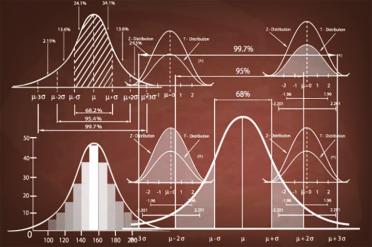
The more times we look at the data, the more we can be confident of the full picture we are revealing. The things which only come up once, you can then eliminate - they are very likely to be errors. The rest takes the form of a distribution, which usually has the shape of a bell curve.

If you run a sequencing experiment and you don’t get a nice statistical distribution, there’s no reason to think that you can assemble a genome with it. But the interesting thing is that you can already get some information purely from the statistics.

Humans are diploid. Sometimes we inherit the same version of a gene from both our parents, but other times we inherit two different versions. You can see this in the statistical distribution, which (with good data) will have two peaks.

In the animation below, you can see a representation of a statistical distribution of genome data. The black bars to the left represent likely errors, while the red bars represent the likely statistical distribution of the data

What simple advice would you have to someone who has very little experience in understanding statistics, but wants to be able to compare data (such as that being shared at the moment)?

I would recommend reading the methods section. This is the crucial part of the report. Methods are not separate to empirical claims: it is how to make those claims.

Daily counts of COVID-19 deaths are an example. In England, Scotland, and Northern Ireland, the same definition holds. Among notified deaths, it is the number within 28 days of a positive test.

In Wales, the criteria differ. The death must be in a Welsh hospital or care home. The person must have a positive lab test. Doctors must suspect COVID-19 was a causative factor.

Statistics offices count weekly death certificates which mention COVID-19. Death certificates mention causes or contributory factors. Those mentions do not need a positive test either.

The measure may sound simple, but countries count ‘COVID-19 deaths’ in different ways. Standard definitions do not arise by accident. For labour market statistics, it took decades to establish and maintain.


A statistical distribution, such as this 'bell shaped curve' is a common feature of biological data sets
StatsImageinarticle

What's your favourite thing about statistics and data?

There are loads, so it is hard to pick one.

The Central Limit Theorem is majestic. We can take any distribution that has a finite mean and variance. From that distribution, the mean average of a random sample tends towards a Normal shape. Out of chaos comes order.

That is very useful for modelling and inference, as we can use Normal approximations. It is cheap in computational terms: we cannot always burn through processor cores. The theorem shows why we see these bell-shaped curves so often in natural systems.

Dr Anthony B. Masters is a Statistical Ambassador for the Royal Statistical Society. He has an MMath and PhD from the University of Bath, and works as a digital insight analyst for Nationwide Building Society.

In his voluntary role as a Statistical Ambassador, Dr Masters has contributed to BBC and Full Fact articles, among others, and he writes about statistics, survey research, and coding in R on Medium.